
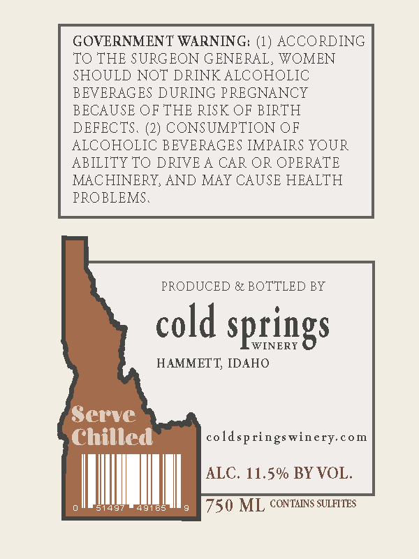
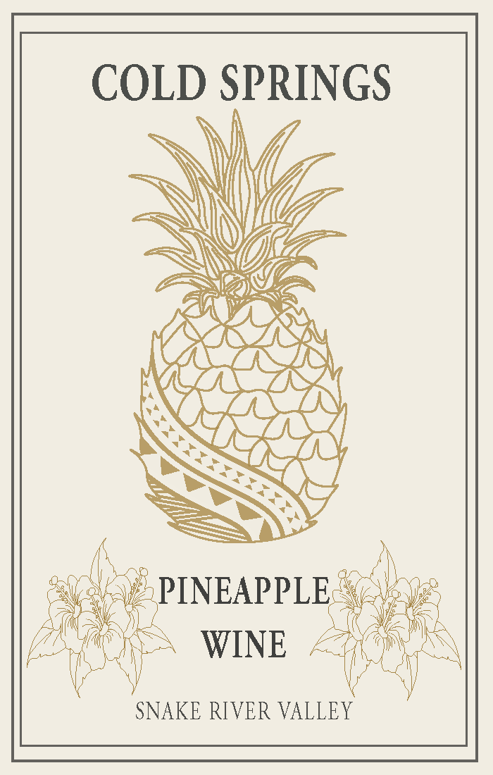
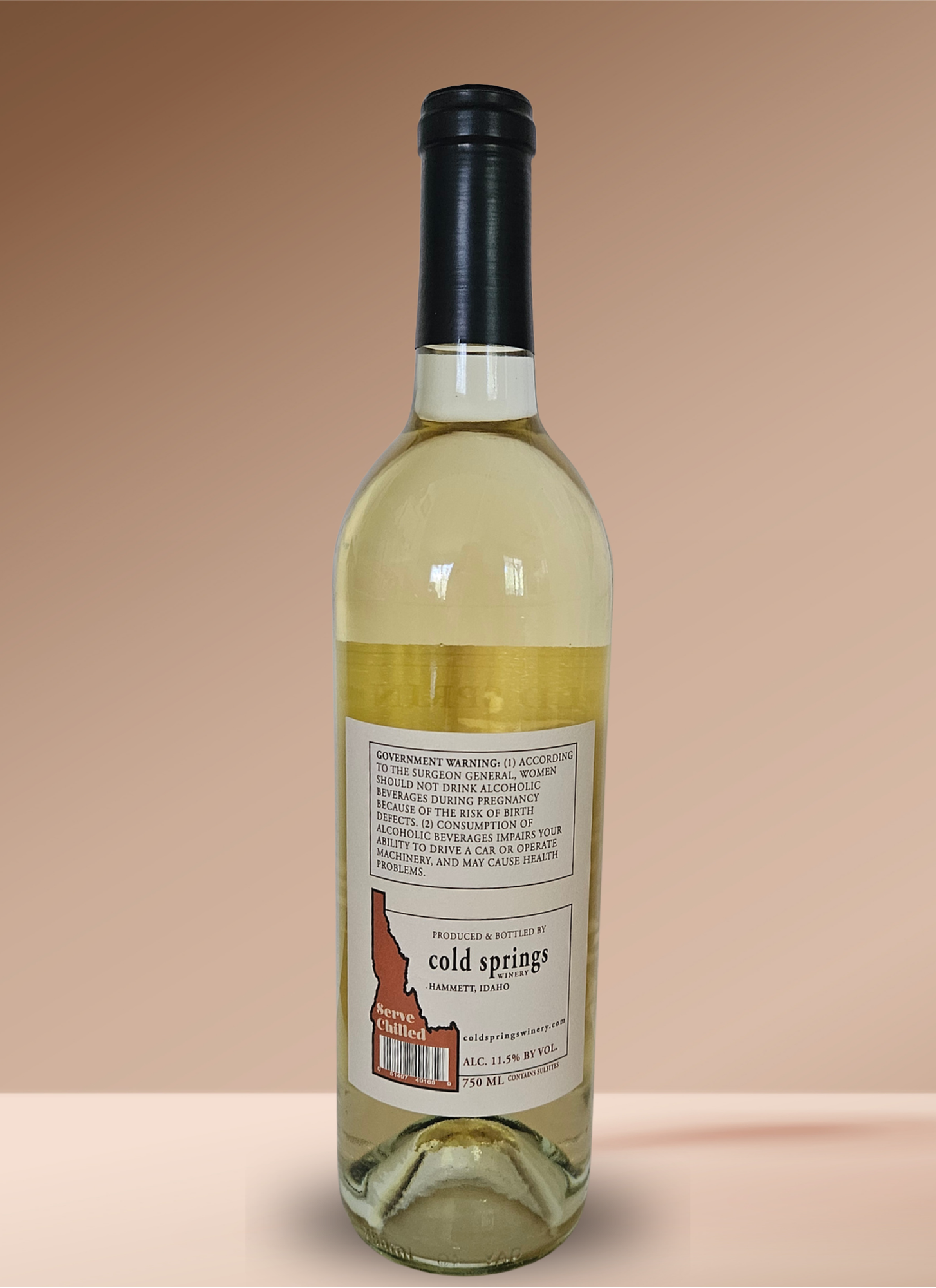
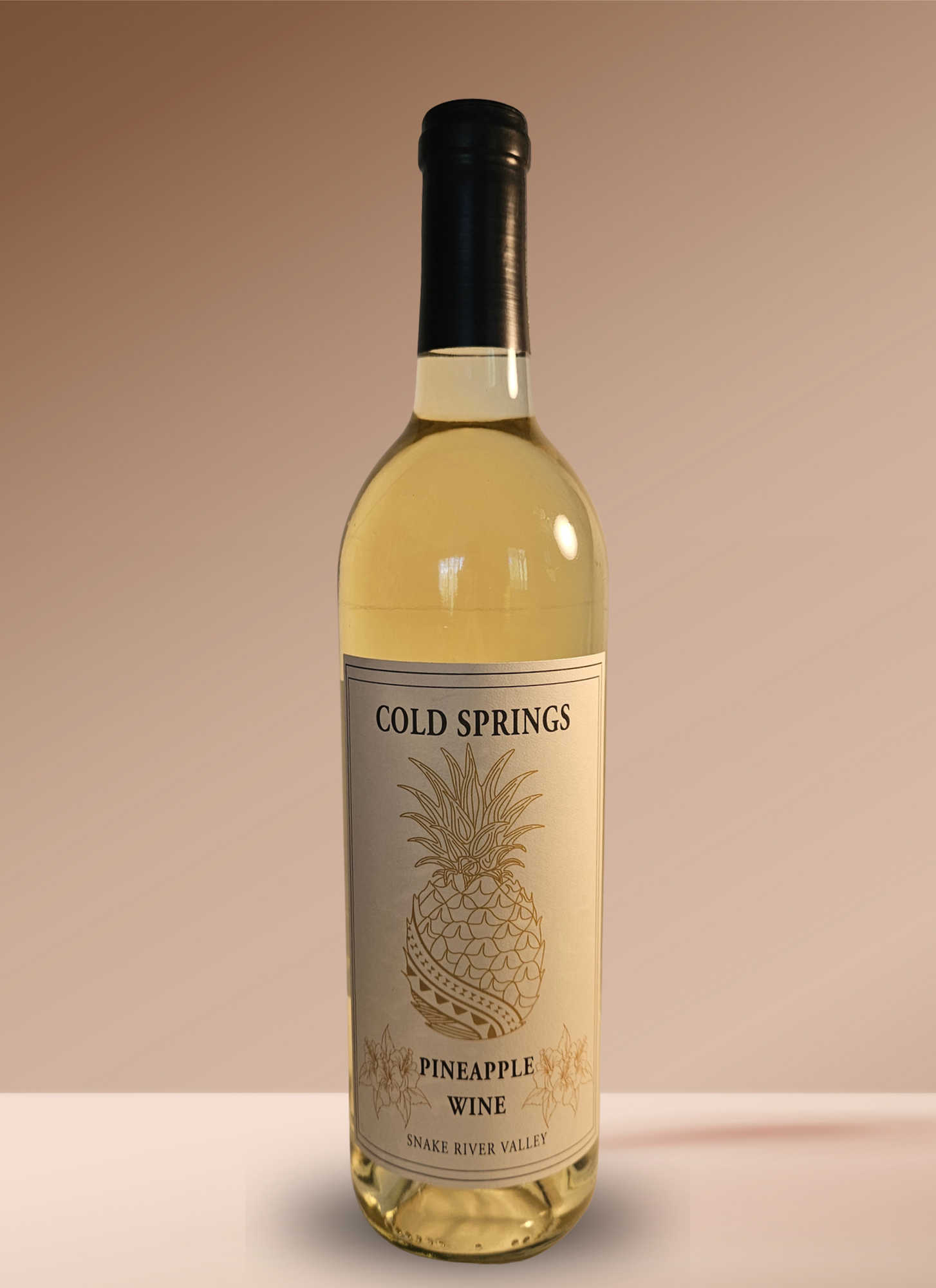
Cold Springs
Cold Springs is a packaging redesign created for a client who wanted their existing label refreshed while preserving the original concept. I redrew the pineapple illustration in a more stylized, upscale style and streamlined the typography to one or two complementary fonts for better legibility. This project focused on refinement over reinvention, honoring the brand's intent while elevating its visual presentation. The final design reads cleaner, feels more premium, and holds up better across sizes and print applications.